Disneyland Paris has had five official names in 34 years, three of them in its first 30 months. Since 4 April 2009 it has carried the same name it had between 1994 and 2002, and this stretch has already lasted longer than the previous four combined: it overtook them on 27 March 2026, two days before the second park stopped being Walt Disney Studios and became Disney Adventure World.
Every name change brought a new logo, and almost none of them answered a design problem. They answered business problems: a word that sounded like banking to Europeans, a second park that needed explaining, an anniversary to celebrate. What is interesting is what each logo chose to draw to solve it: sometimes a character, sometimes a building and, when the brand feels secure, just the name.
This article walks through that evolution with dates and reads it the way I read the park: what gets shown, what gets simplified and what survives when everything shrinks to the size of an icon.
Five Names in 34 Years
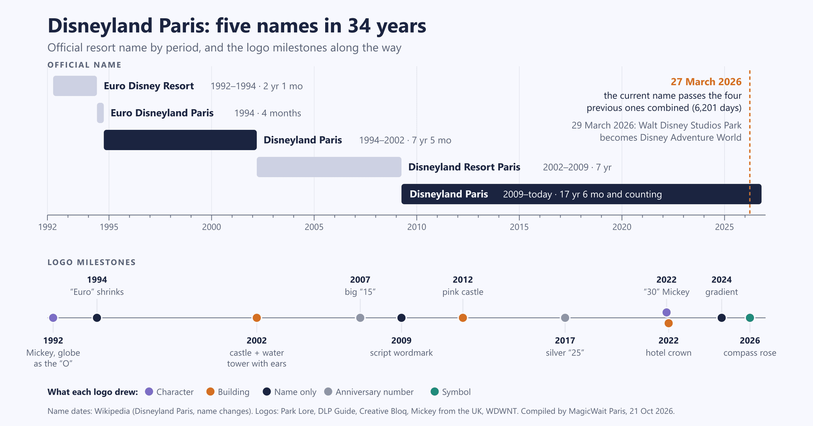
The two dark blue periods are the same name, Disneyland Paris. The second, which began in 2009, is already longer than the other four put together. Below, the logo milestones by what each one draws.
| Period | Official name | From | To | Length |
|---|---|---|---|---|
| 1 | Euro Disney Resort | 12 Apr 1992 | 31 May 1994 | 2 years 1 month |
| 2 | Euro Disneyland Paris | 1 Jun 1994 | 30 Sep 1994 | 4 months |
| 3 | Disneyland Paris | 1 Oct 1994 | 15 Mar 2002 | 7 years 5 months |
| 4 | Disneyland Resort Paris | 16 Mar 2002 | 3 Apr 2009 | 7 years |
| 5 | Disneyland Paris | 4 Apr 2009 | today | 17 years 6 months |
Lengths calculated by MagicWait Paris as of 21 October 2026. The first four periods add up to 6,201 days; the fifth reached that figure on 27 March 2026 and now stands at 6,409.
The first three names fit into 29 and a half months because the problem was a single word: “Euro”. Michael Eisner, Disney’s chief executive at the time, put it this way: to Americans, “Euro” sounded glamorous and exciting; to Europeans, it was a word associated with business, currency and commerce. As early as late 1992, marketing started using “Euro Disney Resort Paris” to tie the resort to the city rather than to Europe in general. And there was a second misunderstanding: in Europe, “resort” suggested a luxury beach hotel or a ski station, not a complex in Marne-la-Vallée.
The fix came in two steps. In June 1994, “Euro” became visibly smaller inside the logo. In October it disappeared, and the resort became Disneyland Paris: a city associated with romance and excitement, in Eisner’s own words.
The fourth name, Disneyland Resort Paris, arrived with the second park on 16 March 2002 and followed the California model, which had been renamed Disneyland Resort in 2001. It lasted seven years. On 4 April 2009 the resort went back to “Disneyland Paris”, and that is where it has stayed.
What Each Logo Has Drawn
Line all the logos up and there are only five things to draw: a character, a building, an anniversary number, the bare name or, since 2026, a symbol.
| Year | Logo | What it draws | What it represents |
|---|---|---|---|
| 1992 | Euro Disney Resort | Mickey at his most essential: the park’s calling card, and at the time far more recognisable than the castle | Character |
| 1994 | Euro Disneyland Paris | ”Euro” shrinks to a much smaller size than the rest of the name | Name |
| 1994-1995 | Disneyland Paris | Keeps the nineties colours and shapes of the original, and the castle now appears | Castle |
| 2002 | Disneyland Resort Paris | An arc with stars; the castle for the first park and the water tower with Mickey ears for the second | Buildings |
| 2007 | 15th anniversary | The arc goes; a big “15” and a simplified “Resort Paris” | Number |
| 2009 | Disneyland Paris | ”Disney” in the corporate script with a matching “land”, in navy blue | Name only |
| 2012 | 20th anniversary (unveiled in 2011) | Pink castle, Tinker Bell with her trail of pixie dust and a huge “20”, in a semicircular layout | Building and character |
| 2017 | 25th anniversary | A silver “25” with embossed swirls, in blue and silver | Number |
| 2022 | 30th anniversary | A “30” made from Mickey’s silhouette: the head and one ear form the 3, the other ear forms the 0 | Character |
| 2022 | Disneyland Hotel | A crown shaped like the hotel’s towers, above five stars | Building |
| 2024 | Disneyland Paris | Same lettering; the dark blue becomes a blue-to-purple gradient | Name only |
| 2026 | Disney Adventure World | A stroke that runs through the letters and ends in a compass rose standing in for the “o” | Symbol |
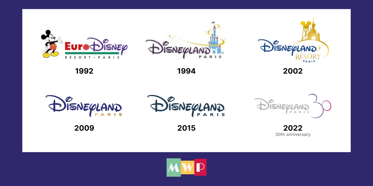
Six resort logos in order. Mickey in 1992, the castle in 1994, castle and water tower in 2002, just the name in 2009 and 2015, and the anniversary “30” in 2022.
My reading is a hypothesis, not something Disney has explained: the castle enters the logo when the resort needs to explain something, and leaves when it doesn’t. In 2002 it had to say there were now two parks, and the answer was to draw two buildings. As an architect, what strikes me is that it put two objects of very different nature and scale into a single drawing: a castle of around 50 metres and a water tower. When two buildings like that share a logo, the size each one is drawn at decides which looks more important. Here, by putting them on equal terms, it clearly tells us that Disney loves its two parks equally.
For the 20th anniversary there was something to celebrate, and the pink castle returned to centre stage. By contrast, in 2009 and in 2024, with the brand established, the main logo keeps only the name. The resort’s most recognisable building no longer needs drawing: the name evokes it on its own.
Why the Castle Takes Over When It Appears
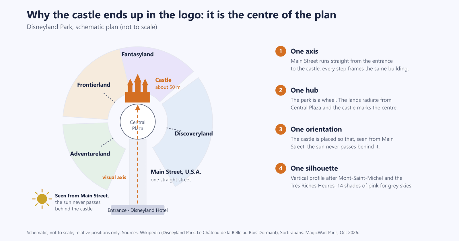
Schematic, not to scale, of Disneyland Park. Distances don’t matter here; the relationship does: one street, one central plaza and a single building closing off both.
The castle doesn’t appear in the logos because it is pretty. It appears because it is the centre of the plan. Disneyland Park is laid out like a wheel: the hub is Central Plaza, in front of the castle, and from there the paths lead to the other lands. Main Street, U.S.A. is a straight street running from the entrance to that hub, so for the whole walk you have the same building in front of you.
In architecture, that is an axis with a visual terminus. Walt Disney called it a weenie: the element that, placed at the end of a view, pulls people into the park and helps them find their way. The Imagineers reinforce the effect with the forced perspective of Main Street and the Central Plaza gardens, which make the castle look further away and taller.
Three design decisions explain why it works so well as an icon:
- The silhouette. It stands around 50 metres tall; its vertical silhouette takes Mont-Saint-Michel as a reference, and its profile draws on the castles in the miniatures of the Très Riches Heures du Duc de Berry. It is a pyramid with a very clear highest point, and that reads from far away without any detail.
- The orientation. It is placed so that, seen from Main Street, the sun never passes behind it. This is a rule shared by every Disney castle: the building that closes the axis is never seen against the light.
- The colour. The façade uses 14 shades of pink so it stands out even under the grey Paris sky, as we covered in our Fantasyland secrets.
There is one fact that, as an architect, I find the most revealing. Tony Baxter, the park’s executive designer, admitted that having real castles a short drive away made them think twice. That is why the Paris castle is not a copy of the American ones: it was designed for a continent that already had the originals.
What Survives When the Castle Shrinks to an Icon
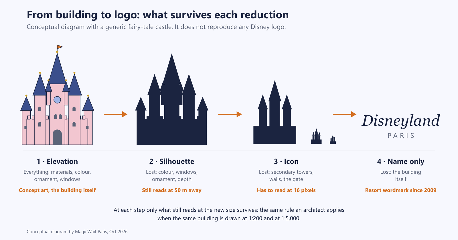
Conceptual diagram with a generic castle. It does not reproduce any Disney logo: it shows what is lost at each reduction.
When you draw a building for a logo you do the same as on a plan at different scales. At 1:200 you draw windows, mouldings and materials; at 1:5,000, only the shape. Each reduction forces you to decide what stays, and what survives is what truly identifies the place.
In the diagram, the elevation has everything. The silhouette loses colour and windows but is still recognisable from a distance. The icon loses the secondary towers and the walls, because it has to read at 16 pixels. The last step loses the building altogether.
Applied to Disneyland Paris, the logos that draw the castle (the 2002 one and the 20th anniversary one) work somewhere between silhouette and icon. The resort logo since 2009 sits at the last step: name only.
2026: The Second Park Changes Its Name and Its Centre
On 29 March 2026, with the opening of World of Frozen and Adventure Bay, Walt Disney Studios Park was renamed Disney Adventure World. The logo was unveiled first on the Earffel Tower, the park’s water tower with Mickey ears, and also on the entrance arch and on the compass rose medallion on the gates.
It is the same object that represented the second park inside the resort logo in 2002. The tower that was once the drawing is now the support.
The new logo swaps the building for a symbol: a stroke runs through the letters and ends in a compass rose standing in for the “o”. A compass rose is, literally, the element that orients a plan. My reading: it fits a park that has been reorganised around a lake and, for the first time, has a clear centre, just as Disneyland Park has the castle. We covered this in the transformation of Walt Disney Studios into Disney Adventure World and in our World of Frozen guide.
The logic has also changed since 2002. Back then, the resort logo squeezed in two buildings to say “two parks”. Now the Disneyland Paris logo stays neutral and the spotlight goes to the park’s own logo.
Where to See All This on Your Next Visit
- The axis from Town Square. Stand at the start of Main Street: the castle sits centred at the far end and, since the sun never passes behind it, you will never see it against the light.
- The castle’s golden snails. On the golden roofs of the lower towers, to the right as you face the castle, what look like balls are Burgundy snails. A very French wink that no logo has ever drawn.
- La Galerie de la Belle au Bois Dormant. Its stained-glass windows were made in London under the supervision of master glazier Chapman, who had worked on the restoration of Notre-Dame de Paris.
- The Disneyland Hotel crown. Its 2022 logo is a crown shaped like the building’s towers: the most literal example of a building turned into a brand. More in our Disneyland Hotel secrets.
- The Earffel Tower and the Disney Adventure World gates, with the new logo and the compass rose.
📱 This list tells you what to look at, but not exactly where it is. In the hidden gems section of MagicWait Paris you have the golden snails and the Excalibur sword in the castle courtyard marked on the map, with a photo, so you can find them without wandering around.
The Idea to Take Away
Next time you walk down Main Street, look at the castle for what it is: the park’s plan turned into a building, and the reason it comes back to the logos whenever the resort has something to explain.
- Five names in 34 years. The current one, in place since 2009, has already lasted longer than the previous four combined.
- The problem in the early years was not the design, it was the word “Euro”.
- The castle enters the logo when there is something to explain (two parks in 2002, the 20th anniversary) and leaves when the brand is established (2009, 2024).
- In 2026, the second park swaps the building for a symbol of orientation: a compass rose.
Disney is so utterly recognisable, not just through its logo but through its lettering too, that it needs very little to express itself. That is exactly why, over the years, it has used these elements as it pleased, giving itself a little extra weight wherever it was needed.
Do you still have an old Euro Disney or Disneyland Resort Paris logo on a ticket, a map or a bag? Write to us at hello@magicwaitparis.com and we will complete this story with your photos. And to get around the park with live wait times, MagicWait Paris.